Logo Design
Logo Design
Our Logo
Our logo embodies our commitment to simplicity, innovation, and home-centered productivity. The clean, minimalist wordmark reflects our design aesthetic, while the green arrow atop the “O” symbolizes a house roof, signifying our focus on enhancing the home office experience.
This arrow also represents the positive transformation we aim to bring to our customers’ lives through our thoughtfully curated products.
Dark Background
Homdio’s logo is designed for versatility, functioning effectively on both light and dark backgrounds. The clean, minimalist wordmark, paired with the iconic green arrow atop the “O,” ensures a visually appealing presentation in various contexts.
While the arrow remains green in all scenarios, its symbolic representation of a house roof and the positive transformation it signifies remains consistent, reinforcing Homdio’s brand identity.
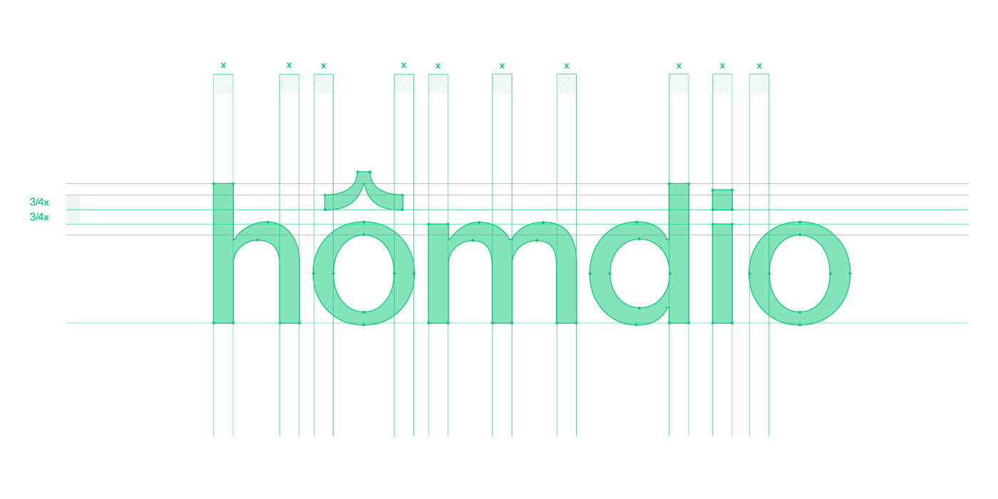
Logo Construction
Our wordmark is carefully crafted to ensure visual harmony. The stems of each letter are consistently thick, while the horizontal lines are intentionally thinner, creating a balanced and visually pleasing composition.
By employing all lowercase letters, we reinforce our commitment to a minimalist and approachable design aesthetic. This choice contributes to the friendly and inviting nature of our brand identity.
Logo Mark
Our logo mark is a streamlined version of our primary logo, designed to function effectively in environments with limited space. This simplified element retains the essence of our brand identity while offering a more compact and versatile representation.
The logo mark is particularly valuable when space is constrained, ensuring that our brand remains recognizable even in smaller applications.


Favicon
The favicon is a highly condensed version of our logo mark, designed for use in tiny spaces such as website icons. This diminutive variation ensures that our brand remains visible even in the most constrained environments.
The arrow icon, a distinctive element of our brand, is maintained in green, regardless of the background color, ensuring clarity and consistency in all applications.


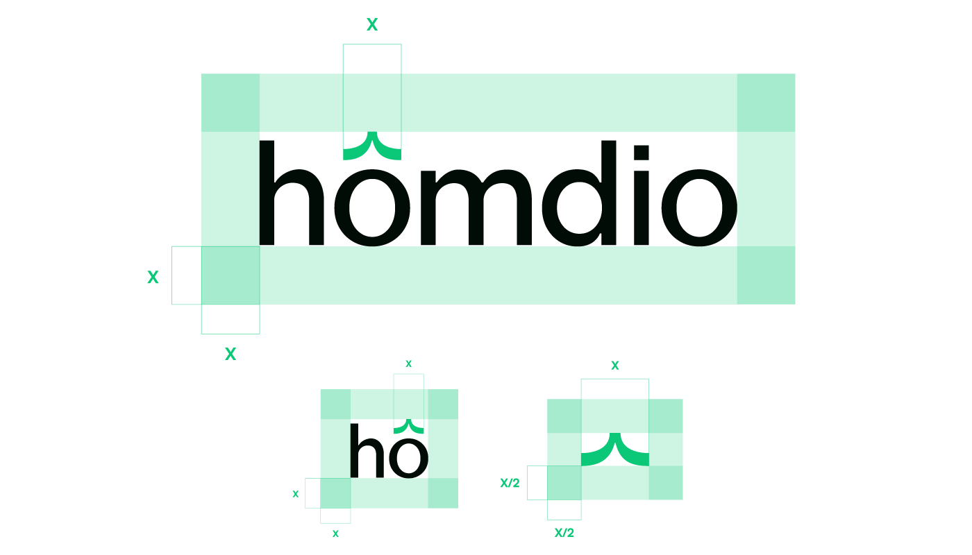
Clear Space
To ensure optimal legibility and visual clarity, we have established minimum negative space requirements around our logos. Using the width of the arrow as our baseline unit (X), we recommend maintaining an X-unit buffer around the wordmark and logo mark.
For the favicon, half the X-unit buffer is sufficient to provide adequate spacing. By adhering to these guidelines, we can guarantee that our logos are presented in a way that is both visually appealing and easy to read.
Unacceptable Logo Uses
The Homdio logo should not be used in a manner that could be perceived as misleading, offensive, or harmful. It is strictly prohibited to alter, distort, or combine the logo with other elements in a way that compromises its integrity or readability.
These are some examples of unacceptable uses of our logo